Color Contrast Checker
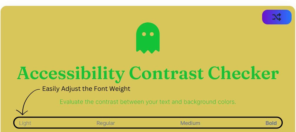
Accessibility Contrast Checker
Evaluate the contrast between your text and background colors.
Light
Regular
Medium
Bold
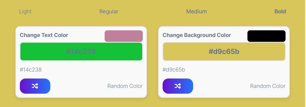
Change Text Color
#be809a
#be809a
Random Color
Change Background Color
#000000
#000000
Random Color
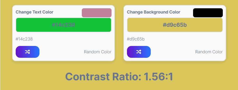
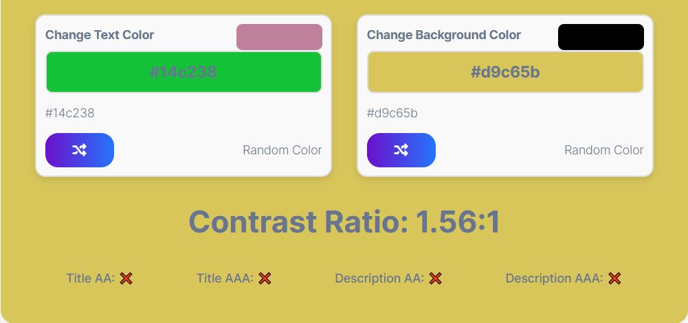
Contrast Ratio: 0.00:1
Title AA: ❌
Title AAA: ❌
Description AA: ❌
Description AAA: ❌
How Does It Work?
The Contrast Checker tool is designed to help you easily evaluate and optimize the contrast between your text and background colors. Here’s a quick guide on how to use it:

- Font Weight Selection:
- At the top of the tool, you’ll find four options: Light, Regular, Medium, and Bold. These allow you to change the font weight of your text to see how different weights affect the visibility of your content. Simply click on any of the options to apply that font weight.

- Color Boxes:
- The tool provides two color boxes: one for the text color and another for the background color. Each box includes:
- Color Display: Shows the current color. The color inside this box represents either the text color or the background color.
- Hex Code: Displays the hex code of the selected color.
- Color Picker: Click the small color picker icon at the top right of the box to manually choose a new color.
- Random Button: Click the shuffle icon button inside the box to generate a random color for either the text or background.
- The tool provides two color boxes: one for the text color and another for the background color. Each box includes:

- Contrast Ratio:
- The tool calculates the contrast ratio between the selected text and background colors and displays it in the format
Contrast Ratio: X.XX:1. This helps you understand how readable your text will be against the background.
- The tool calculates the contrast ratio between the selected text and background colors and displays it in the format

- Suitability Indicators:
- Below the contrast ratio, you’ll see indicators for different levels of text readability:
- Title AA: Shows whether the contrast ratio meets the AA standard for large text (4.5:1).
- Title AAA: Indicates if the ratio meets the AAA standard for large text (7:1).
- Description AA: Displays whether the contrast ratio meets the AA standard for normal text (4.5:1).
- Description AAA: Indicates if the ratio meets the AAA standard for normal text (7:1).
- A green check mark (
✔️) means the standard is met, while a red cross (❌) means it is not.
- Below the contrast ratio, you’ll see indicators for different levels of text readability:
- Auto Update:
- Whenever you change the text or background color, the contrast ratio and suitability indicators are automatically updated. This instant feedback ensures you can quickly adjust colors to achieve the best readability.
- Random Color Generation:
- For a quick color scheme test, use the “Random Color” buttons. The button with the shuffle icon in the text color box will change the text color, while the one in the background color box will change the background color. The contrast ratio will update automatically, helping you find combinations that meet accessibility standards.
By following these steps, you can ensure that your text remains legible and accessible to all users, meeting important web accessibility standards.
.helplink{
border: 1px soild #000000;
border-radius: 5px;
}
.link-table {
width: 100%;
max-width: 300px;
border-collapse: collapse;
margin: 20px 0;
font-size: 16px;
text-align: left;
}
.link-table td {
padding: 8px;
border-bottom: 1px solid #ccc;
}
.link-item {
text-decoration: none;
color: #333;
display: flex;
align-items: center;
}
.link-arrow {
margin-right: 8px;
color: #007BFF;
font-size: 1.2em;
}
.link-item:hover .link-arrow {
transform: translateX(3px);
transition: transform 0.2s ease;
}
More helpful tools
| → Symbol Generator |
| → Gradient Generator |
| → Color Swatch Generator |
| → Random Color Generator |


