

12+ Shades of Color with Hex Codes
Shades of Colors
The Importance of Colors
Colors are a fundamental part of our world, influencing our emotions, behaviors, and perceptions in profound ways.
From the calming blues of the sky to the vibrant reds of a sunset, colors play a crucial role in how we experience and interact with our environment.
They have the power to evoke memories, convey messages, and even impact our moods and decisions.
In the digital age, understanding and utilizing colors effectively is more important than ever.
Whether you’re a web designer, artist, marketer, or simply a color enthusiast, having a comprehensive understanding of colors and their various shades is essential.
This knowledge allows you to create visually appealing designs, build compelling brand identities, and enhance user experiences.
Exploring Shades and Hex Codes
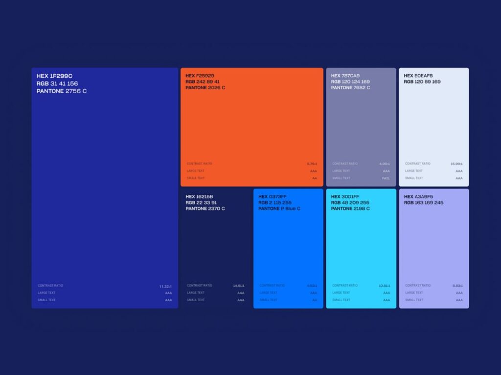
Hex codes are the backbone of color identification in digital design. These six-digit combinations of numbers and letters represent specific colors, allowing for precise color matching and reproduction across different devices and platforms.
By understanding hex codes, you can ensure consistency in your designs, making your work look professional and polished.
On this page, we present over 12 shades for each main color, complete with their hex codes. This extensive collection will serve as a valuable resource for anyone looking to explore the depth and versatility of colors.
From subtle pastels to bold, vibrant hues, you’ll find a wide range of shades to suit any project or preference.
Best Practices for Using Shades of Color
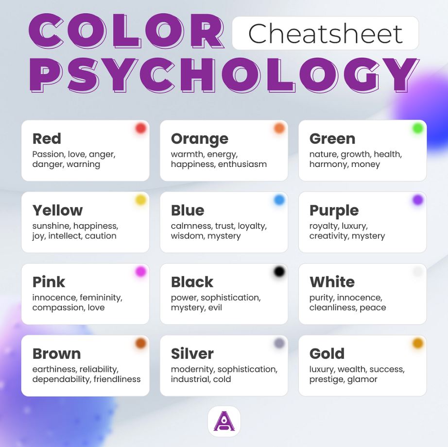
1. Understand Color Psychology
Colors evoke specific emotions and reactions. Understanding the psychology behind each color can help you choose the right shades for your project. For instance, blue often conveys trust and calmness, while red can evoke excitement and urgency.
2. Maintain Consistency
Consistency is key to creating a cohesive and professional look. Use a consistent color scheme throughout your design to ensure harmony and balance. This applies to websites, branding, marketing materials, and more.
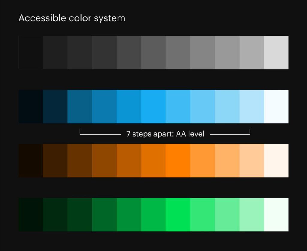
3. Consider Accessibility
Make sure your color choices are accessible to all users. Use high contrast between text and background colors to ensure readability. Consider how your colors appear to those with color vision deficiencies by using tools like color contrast checkers.
Use Color to Guide the User
Colors can help guide users through your design. Use brighter or more intense colors to draw attention to important elements, such as call-to-action buttons, while using softer shades for background elements.
Create Visual Hierarchies
Different shades of the same color can be used to create visual hierarchies. For example, a darker shade can be used for headings, while a lighter shade can be used for body text. This helps users easily navigate your content.
Experiment with Color Combinations
Don’t be afraid to experiment with different color combinations. Use tools like color wheels or online color palette generators to find harmonious and complementary color schemes. This can add depth and interest to your designs.
Keep Cultural Context in Mind
Colors can have different meanings in different cultures. When designing for a global audience, be mindful of cultural differences in color interpretation to avoid miscommunication or offense.